Principles, framing the knowledge visualization [Knowledge visualization series part 3]
This article by Hanlie Smuts is part 3 of a series of articles exploring knowledge visualization aspects from an organizational perspective.
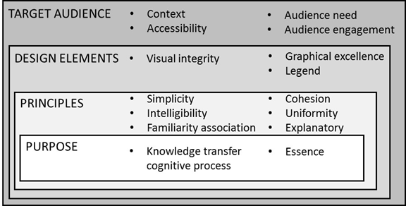
Knowledge visualization refers to the application of visual representation techniques from multiple visualization domains aiding knowledge-intense processes such as knowledge sharing among employees in an organization. Scholars have established that powerful and memorable learning experiences may be achieved through a well-designed visual image as opposed to a mere verbal or textual description. I shared the framework in part 1 of the series and include it here for context and to show the topic areas of the series of articles.

Our focus for this part is on the design principles. Design principles depicts the key considerations when designing the knowledge visualization aligned to the purpose (discussed in part 2), and aims to establish a good design that is simple to understand, cohesive and explanatory in nature. Employees must be able to easily associate the knowledge visualization with the organizational purpose and the objective of what needs to be achieved with the knowledge transfer.
This section of the knowledge visualization framework has 6 organizational impact levels. Simplicity points to the minimization of the number of concepts in each level of knowledge visualization, while intelligibility guides that the knowledge visualization should be easy to understand and not be ambiguous. Cohesion is the principle of working together and in the context of knowledge visualization, it implies that the relationship among knowledge concepts, must be shown clearly. Uniformity of visual elements such as color, symbols, shapes, etc. should be the same for the same kinds of information.
- Do not underestimate the difficulty in achieving simplicity – one is often enticed to add more detail to ensure understanding. Visual noise will impact the learning experience yo intended to achieve for your employees.
- You want to grab and hold the attention of your employee. Safeguard that your knowledge visualization is not fragmented, as it will impact visual appeal and potentially demotivate your user.
- Ensure that your knowledge visualization elements seem to belong together and promote cohesion by using similar sizes, shapes, and colors. Similarly with the use of white space and borders at the display boundaries.
By associating knowledge visualization with familiar real world images, the target audience is enabled to recognize and interpret visuals rather than to have to remember and recall meaning.
- Associating visualization with real world allows a recognition-based approach to interpreting images instead of one that requires recall.
- Just think about the significant number of icons available denoting men and women. Think about your organization and its institutional symbols and vocabulary. Choose industry sector and organizational specific symbols for your knowledge visualizations.
The explanatory power element ensures that knowledge visualization has both explanatory and descriptive value.
- Descriptive value gives details and describes the knowledge that the target audience needs to understand, while explanatory value gives the reasons for it.
- In the organizational context, its application is closely related to whether knowledge recall is required, whether new insights are shared or whether existing knowledge is elaborated upon.
In part 4 of the series, I will describe the design elements towards knowledge visualization efficacy.
Next part (part 4): Design elements towards knowledge visualization efficacy.
Header image source: Gerd Altmann on Pixabay, Public Domain.


